

Tainan Farmers Association|臺南青農聯誼會品牌設計
此品牌識別設計為提案稿
品牌概況|Overview
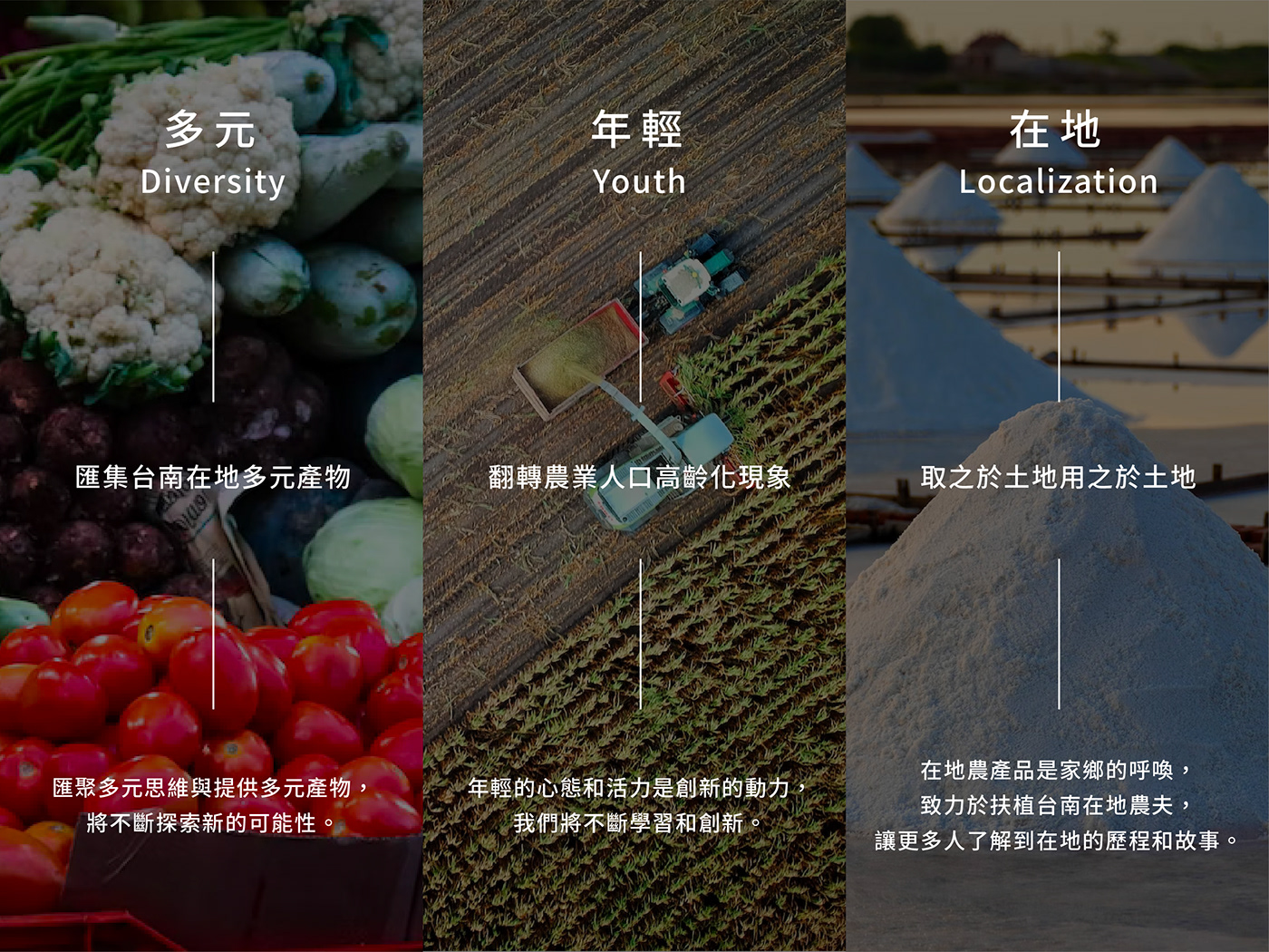
臺南青農聯誼會是一個旨在扶植台南在地青年農夫,共同發展出在地特色農作產物的組織。秉持著共好、創新、永續的理念,致力於「從農路上一起向前」。我們希望透過這個組織,讓更多人能夠了解到在地農作物的價值,並支持當地農友。我們相信,只有透過大家的努力,才能讓台南的農業持續發展,創造出更多具有在地特色的農作產物。未來將不斷努力,讓這個組織成為台南在地農業發展的重要角色。
The Tainan Youth Farmers Association is an organization dedicated to supporting young farmers in Tainan and developing local agricultural products together. Upholding the values of mutual benefit, innovation, and sustainability, we are committed to moving forward together on the path of agriculture. Through this organization, we hope to raise awareness of the value of local agricultural products and encourage support for local farmers. We believe that only through the efforts of everyone can the agriculture of Tainan continue to thrive and create more locally distinctive agricultural products. In the future, we will continue to work hard to make this organization an important player in the development of Tainan's local agriculture.
挑戰|Challenge
作為一個新興的農產組織品牌,想要創造出與以往不同的體驗,因此我們從過往的範例重新思考如何擁有新穎的品牌,回顧台灣地方青農識別設計,我們可以發現:
・標誌設計形式繁雜傳統,較缺乏年輕親近感
・品牌識別系統以單一標誌形式呈現,延展應用不易
・意象具體清晰,但容易落於一致趨同
As a new agricultural brand, we want to create a unique experience that sets us apart from others. Therefore, we have reconsidered how to create a novel brand by looking back at previous examples. When reviewing the identity design for local young farmers in Taiwan, we noticed the following issues:
・The logo design is complex and traditional, lacking a sense of youthfulness and approachability.
・The brand identity system is presented in a single logo form, making it difficult to expand and apply.
・The brand identity system is presented in a single logo form, making it difficult to expand and apply.
・The imagery is clear and specific, but it easily falls into uniformity.

策略|Strategy
因此,我們透過問題收斂與視覺分析,對於品牌設計提出以下策略
・重新定義標誌設計,使其具有親近現代感
・延展設計系統,使形象完整統一
・轉化、塑造台南在地語彙,形成鮮明在地特色
Therefore, through problem convergence and visual analysis, we propose the following strategies for brand design:
・Redefine the logo design to make it more modern and approachable.
・Expand the design system to achieve a cohesive and unified image.
・Transform and shape the local vocabulary of Tainan to create a distinct local character.
核心價值|Core Value
標誌設計|Logo Design
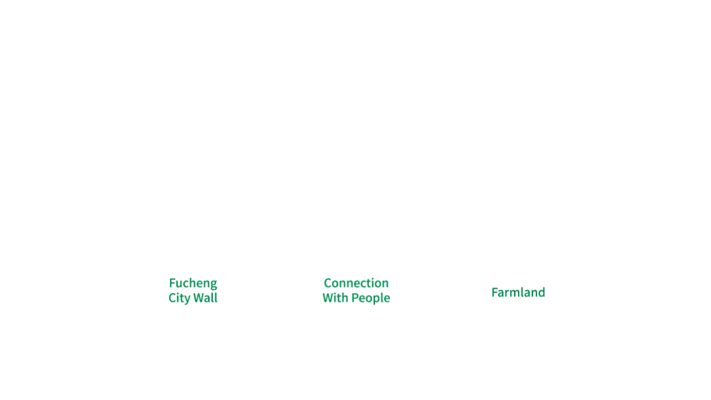
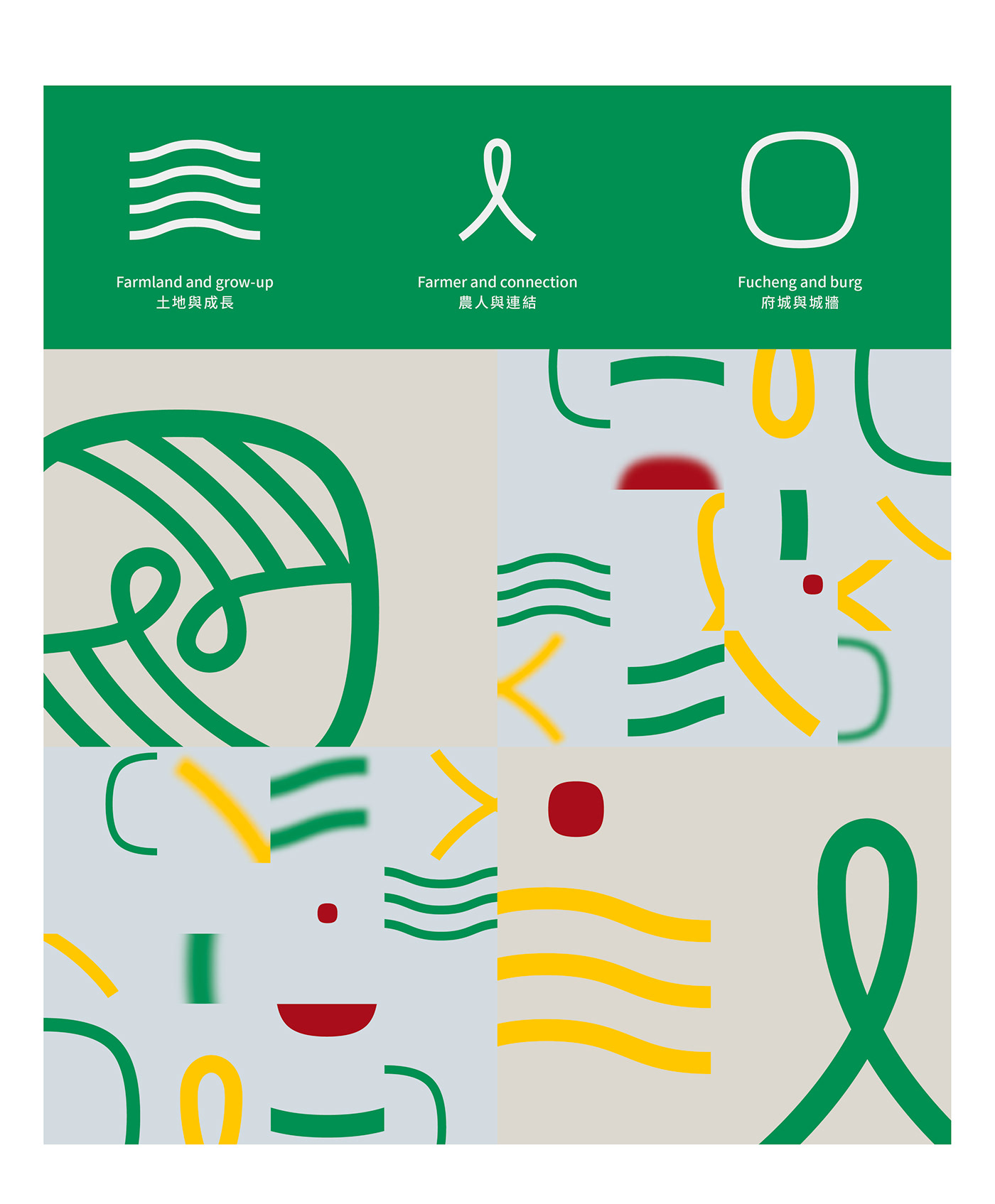
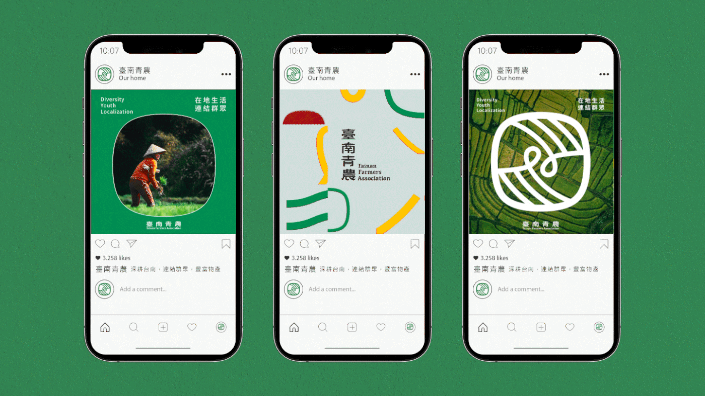
標誌設計以「府城的圍牆」、「人的連結」、「多元田地」為發想,融合台南在地的元素,並用現代簡約的方式詮釋。「府城」為台南的古稱,因此,我們以府城的圍牆為基礎,轉化為簡潔的線條圖案,呈現出現代感;「人的連結」是臺南青農的目標,透過連結在地的青年農夫,象徵彼此之間的連結和合作;「田地」所代表的農業是台南重要的產業之一,透過象徵田地的符號,讓大眾重新認識農業不同的一面。
標誌字設計以「稻浪」作為筆畫特徵發想,將城牆意象融合隸書特徵,並且加入橫筆畫中「上升」造型,給予進步的意涵。
The logo design is inspired by three concepts - "the city wall of the ancient capital", "the connection of people", and "diverse farmlands", incorporating local elements of Tainan and interpreting them in a modern and minimalist way. "The city wall" is a historical reference to Tainan, so we based the design on the city wall and transformed it into a simple and clean line pattern, presenting a modern sense. "The connection of people" represents the goal of Tainan Youth Farmers Association, symbolizing the connection and cooperation between local young farmers. "Farmlands" represent one of the important industries in Tainan - agriculture. By using the symbol of farmlands, we aim to let the public see a different side of agriculture.
The typography design is inspired by "rice waves", combining the image of the city wall with the characteristics of calligraphy, and adding an upward stroke to represent progress.


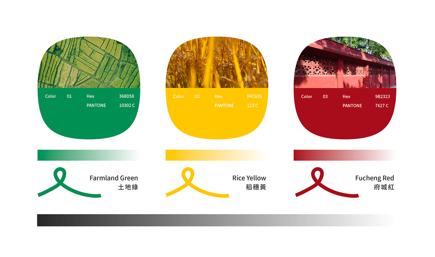
色彩系統|Color System
延伸圖形|Graphic Element

延伸應用|Extention Applied


